

ORIGIN OF THE REPORT
This report is to inspire clients on what visualizations are possible in Power BI. It is used as example of an online course where people are trained to be Power Bi experts.
VISUALIZATION USED
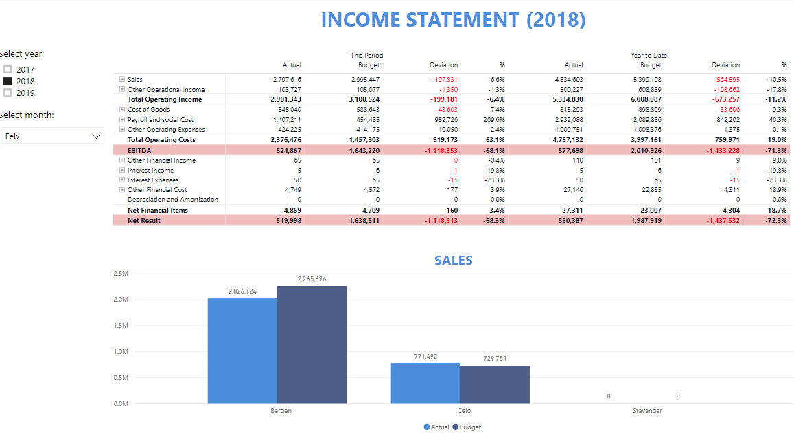
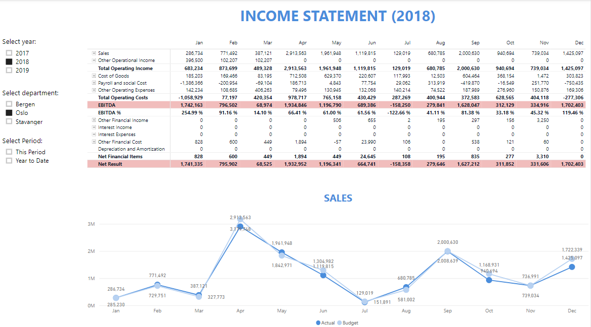
The report shows examples of how to present your sales data and geographical data in a Power BI Dashboard


ORIGIN OF THE REPORT
This report was build for a client and is a fully functional HR dashboard build in Microsoft Power Bi. This is a HR demo dashboard especially created to give a taste of what dashboards and insights can be created with data retrieved from a HR system and database.
VISUALIZATION USED
For this report the excel sheet provided by the company had to be transformed into a excel sheet that can be used for a Power BI dashboard. This dashboard is a combination of charts, tables and buttons.


ORIGIN OF THE REPORT
This report was build for a client that did a diversity survey among the people working at the company. They wanted to have insight in how diversity in the company is perceived and where they could improve on the working situation for people from different backgrounds.
VISUALIZATION USED
For this report the excel sheet provided by the company had to be transformed into a excel sheet that can be used for a Power BI dashboard. This dashboard is a combination of charts, tables and buttons and a couple more visualizations that the client wanted to have added to the dashboard.


ORIGIN OF THE REPORT
This report is to inspire clients on what visualizations are possible in Power BI. The data used for this dashboard is COVID-19 cases in the world.
VISUALIZATION USED
The report shows examples of how to present your data and geographical data in a Power BI Dashboard


ORIGIN OF THE REPORT
This report was build for a client to get more insights in their financial statements and to transfer the financials statements from Excel sheets to a Power BI report that can be shared within their company and can be updated easily by one of the analysts within their company.
VISUALIZATION USED
For this report the excel sheet provided by the company had to be transformed into a excel sheet that can be used for a Power BI dashboard. The Profit Base Financial Reporting Matrix has been used to build the financial reports of the company.


ORIGIN OF THE REPORT
This report was build for a client who needed help with his school project. The client needed some guidance on how to transform a data set into multiple tables and how to decide between dimension tables and fact tables. In addition, the client want the know how to create basic visualizations with the data while making sure the visualizations would answer a couple interesting questions of the board of directors of the colleges.
VISUALIZATION USED
For this report the excel sheet provided by the client had to be transformed into multiple dimension and fact tables. Most visualizations are simple line graphs, some filters and some basic tables.


ORIGIN OF THE REPORT
This report was build for a client who needed to load financial statement data of stock listed companies in the U.S. from the database of INTRINIO into Power BI and create a couple of simple visualizations in the report. For this dashboard a python script loads data into an SQL server on a daily basis and the SQL server is connected to this report to make sure the most recent data is available. The connection to the SQL server is offline for this sample report.
VISUALIZATION USED
The report shows a couple graphs with stock price and dividend yield development over a couple years for multiple stock listed companies. In addition, there are also graphs that show the development of revenue, expenses and turnover over a couple years and for multiple stock listed companies.


ORIGIN OF THE REPORT
This report was build for a client who needed to build a dashboard for educational purposes within his company. The data is fictional data of Arabic super markets that are selling different bottles drinks.
VISUALIZATION USED
The report has a build-in menu for the filters that can be used for the visualizations, basic visualizations and images of the soft drinks that were sold by the different supermarkets.

ORIGIN OF THE REPORT
This report is to inspire clients on what visualizations are possible in Power BI.
VISUALIZATION USED
The report shows examples of how to present your sales data and geographical data in a Power BI Dashboard


ORIGIN OF THE REPORT
This report is to inspire clients on what visualizations are possible in Power BI.
VISUALIZATION USED
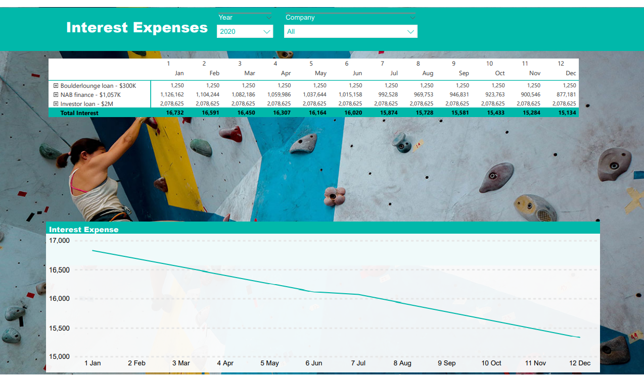
The report shows examples of how to present your financial reports in a dashboard.

ORIGIN OF THE REPORT
This report is to inspire clients on what visualizations are possible in Power BI.
VISUALIZATION USED
The report shows examples of how to present your sales data and geographical data in a Power BI Dashboard


ORIGIN OF THE REPORT
This report is to inspire clients on what visualizations are possible in Power BI.
VISUALIZATION USED
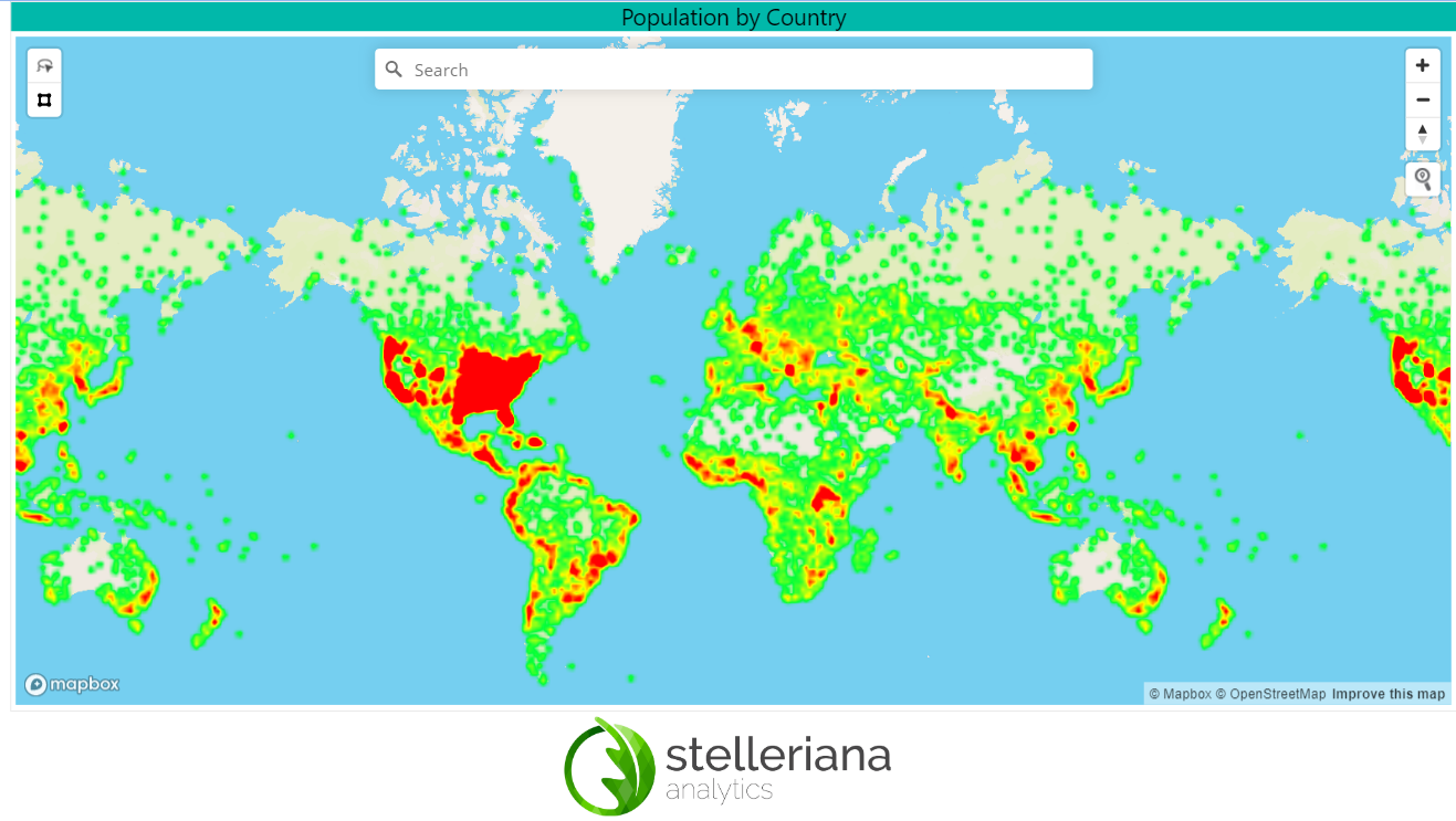
The report shows examples of how to use maps in a Power BI Dashboard